
Station and platform floors have traditionally been unadorned, and only recently has their potential as a blank canvas for relaying information to passengers been utilised. The floor is the stage on which the drama of the station unfolds, the coming and going of passengers, the choice of passageways, the occasional lost individual or group, the stopping for a card top up. Progressive transport agencies are now using this dimension to further assist passengers with safety and navigation indicators.
There are a myriad of functions that stations provide, leading to a large number of choices that passengers need to make (until their transit becomes routine and unthinking). Whilst adverts adorn most available walls, directional wayfinding has had to compete against it. A new dimension in wayfinding is increasingly being used to help orient passengers, lead them to their correct platform or exit, and where to stand so as to be out of the way and optimise passenger flow.
As we looked at in our piece of IKEA cartography, the Swedish giant uses floor markings and projected arrows to nudge shoppers in the desired directions. These got us thinking about the examples we've seen on public transport, their specification implementations, and best practices. This article is indicative, providing transport examples from around the world. There are doubtless many dozens of other examples that can be drawn upon for inspiration.
Hospitals, educational institutions, industrial premises, and warehouses have used floor take extensively to assist new and existing users to find their way around large buildings and complexes. As well, ground markings simply and clearly delineate the areas on corridors that must be kept free of obstruction to maintain safe distances between people, equipment, and merchandise, and to indicate varying levels of danger. Often, some of these buildings are old and have been extensively added to, so the logic of the original architecture’s passenger flow has been greatly disrupted. This of course is the same situation in many public transport interchanges, where new interchanges, exits, and amenities have accrued over decades.
General increase in use of floor markings
As society becomes more used to seeing flooring directions, hopefully they will be more mindful of them. Of course, people are human, and staring at a mobile, speaking with others, and/or corralling children will mean much such indicators will be missed. But people also take their cues subconsciously from where other people are walking and standing.
However, some transport agencies have lagged in instituting such low lying wayfinding. Fortunately, underfoot indicators are increasingly being used on public transport to guide passengers to their line, platform, lift, or exit.
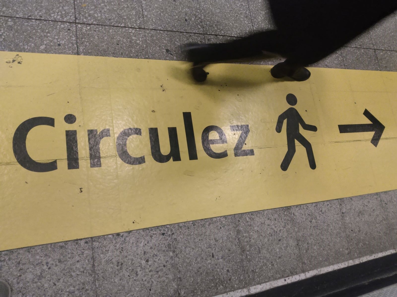
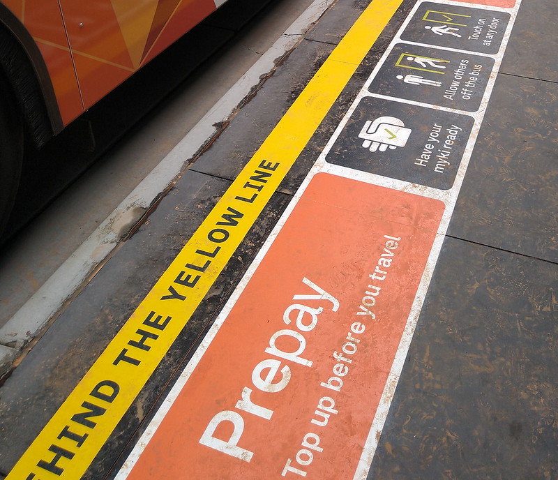
With the increasing clutter of advertising, and sometimes wayfinding signage itself at busy stations, many public transport systems are going low. Floor signage compliments, not replaces, existing signage and maps. It is cheap, quick to apply, and easy to replace in most instances, so is an ideal way to improve wayfinding with minimal labour or interference of existing signage or adverts.
As adverts increasingly permeate stations and clammer for passengers’ attention. Wayfinding in such cluttered environments, with sometimes odd angle passages which are disorienting, needs to be intuitive. Floor tape provides a continuous path to take the passenger all the way to their train platform, other mode, or exit.
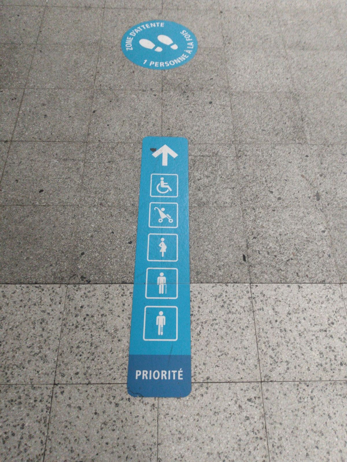
The ‘stand here to let passengers exit’ lines function like the penalty area in football, wherein the goalkeeper is allowed to handle the ball. On platforms, awaiting passengers need to give the exiting passengers the same space and respect.
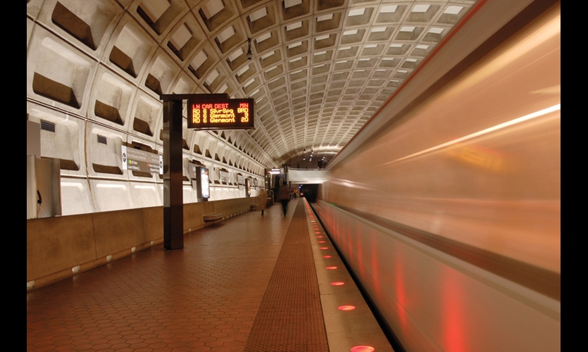
The apogee of platform safety is Washington DC’s WMATA Metro, It uses flashing lights built into the platform edge to announce an approaching train since the beginning of the network in the 1970s. Instead of using a bright platform edge colour, white lights demarcate the platform edge when clear of trains.
The two main types of ground markings
There are two main types of ground markings – visual and tactile.
Note that visual flooring stickers can also have a tactile component – sometimes flooring and stickers have a find gritty texture for additional traction in wet environments.
Conversely, tactile pavers are sometimes denoted by a subtle or contrasting colour, depending on the context.
Platform edges
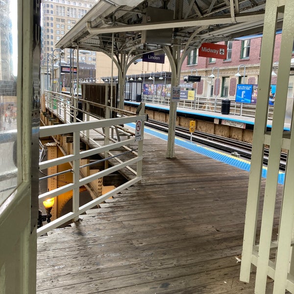
With increasing numbers of public transport users over the last few decades, platforms have become increasingly crowded. As have the numbers of passengers falling off platforms onto the track, with some injuries and deaths occurring. To reduce this, most systems worldwide have installed platform edge tactile flooring in high visibility orange or yellow for maximum observability. However, some networks use different colours - Chicago for some reason uses blue platform edges, for all lines, not just its Blue Line:
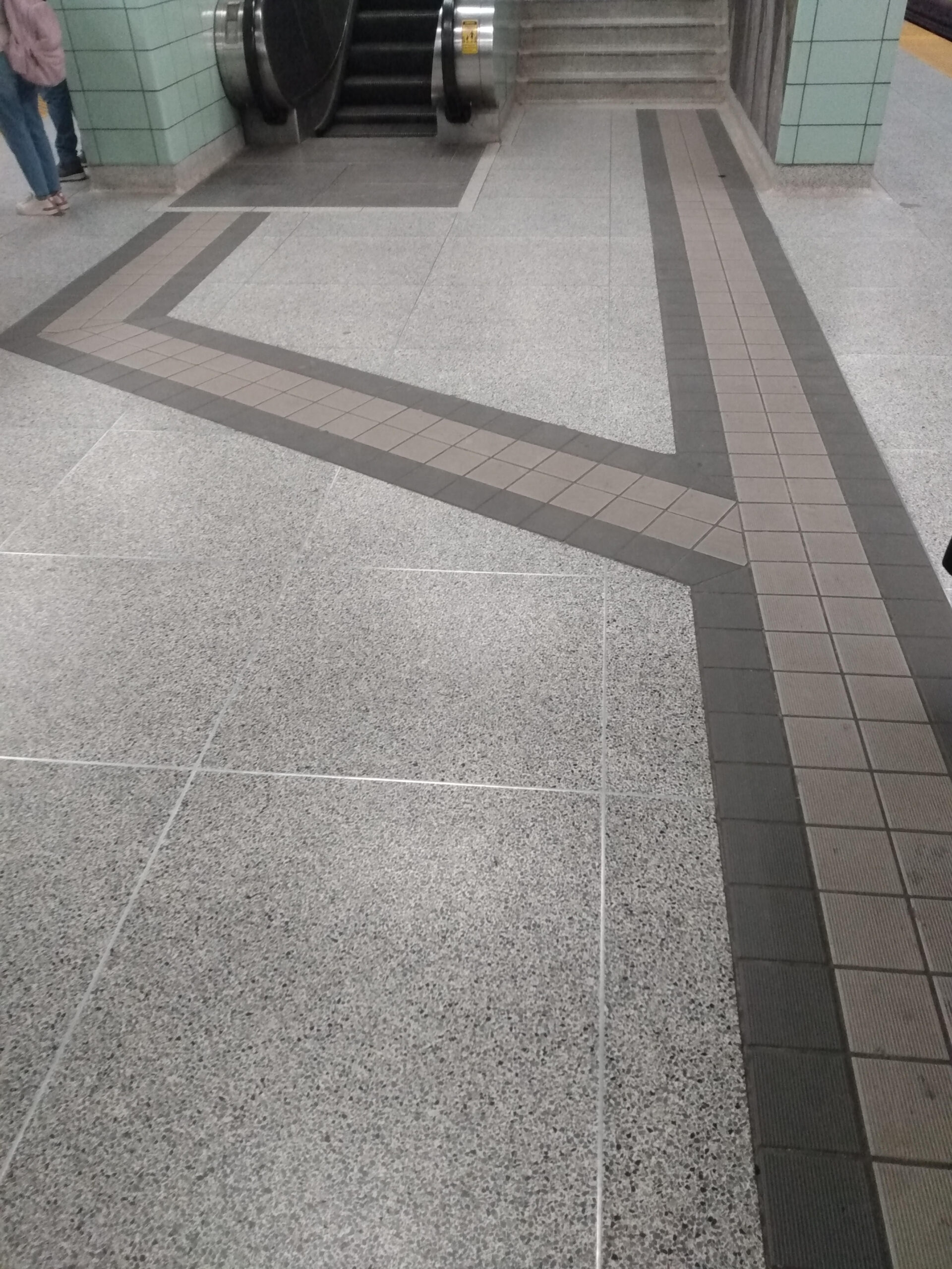
Design history of ground markings
To gain some insight into the history, design, and extent of public transport ground markings, I interviewed Rob Mayo, Human Experience Designer and Lead Trainer on best practice wayfinding design and implementation for UITP (the International Association of Public Transport. He is an expert on ground markings on rapid transit networks, and had written an article on one of the originators of this practice, Seiichi Miyake, who designed his Tenji Blocks as a wayfinding device. Yet as we have seen with platform edges, tactile blocks are often used outside of Japan as a safety device. Mayo states that tactile pavers “are the continuously under-utilised aspect of wayfinding worldwide. They must be included as an integral part of a wayfinding system.”
When I asked Mayo which cities had the best station and platform wayfinding, without hesitation he considers Japan as best in class. The next best wayfinding design right now is in Hong Kong and Montréal. All those cities’ networks use ground markings extensively. After these exemplars, however, it is a bit of a mixed bag.
Let us look at the state of the art
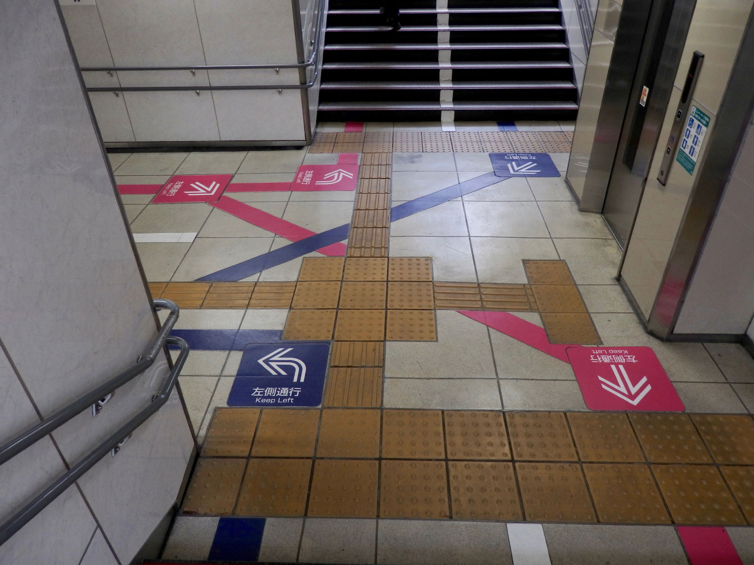
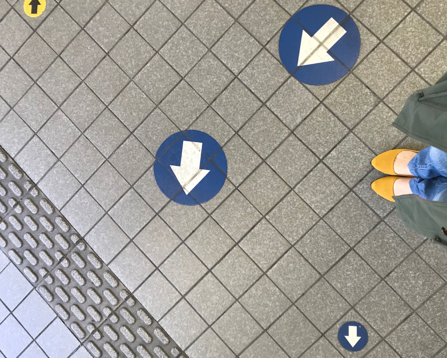
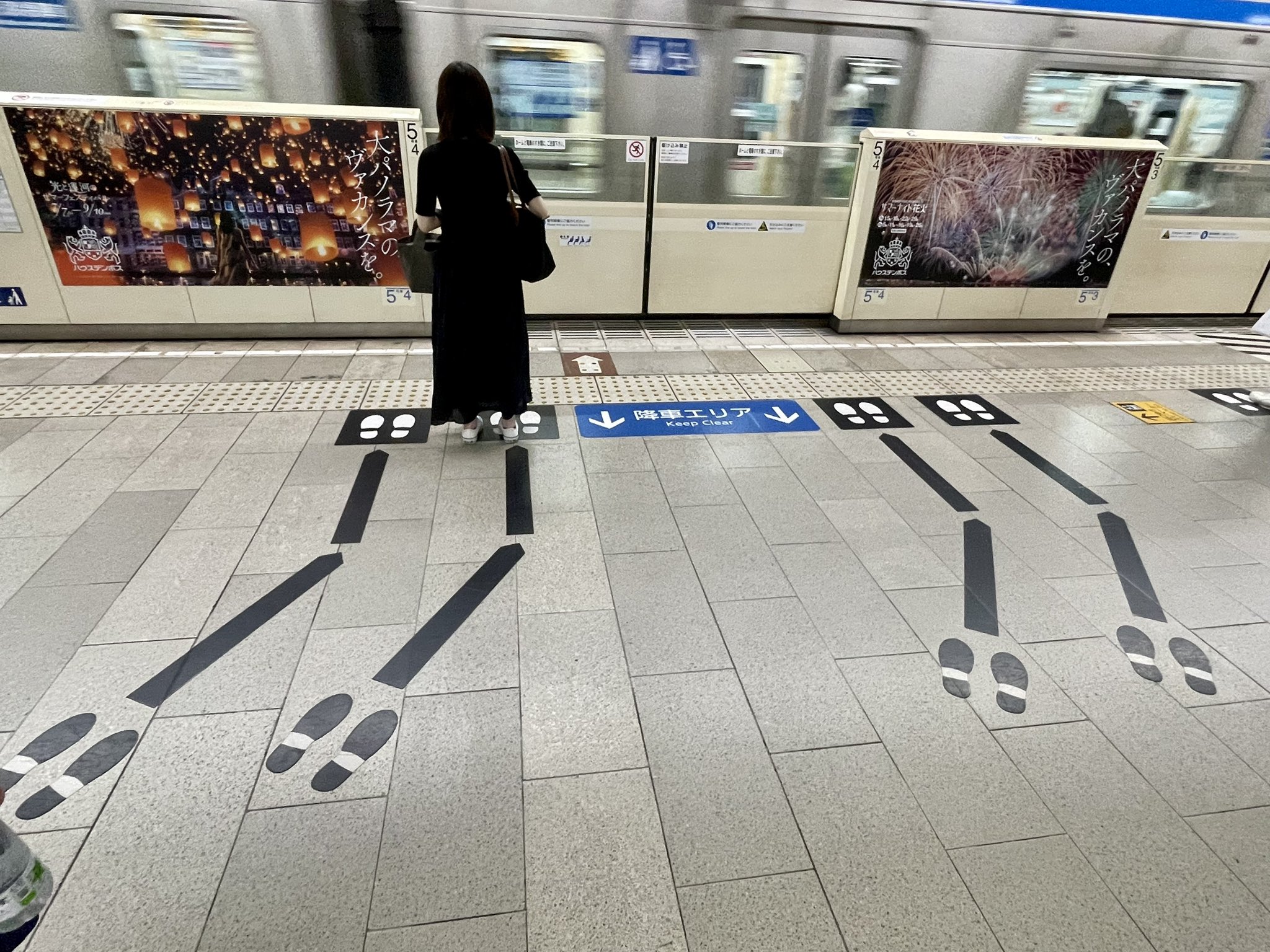
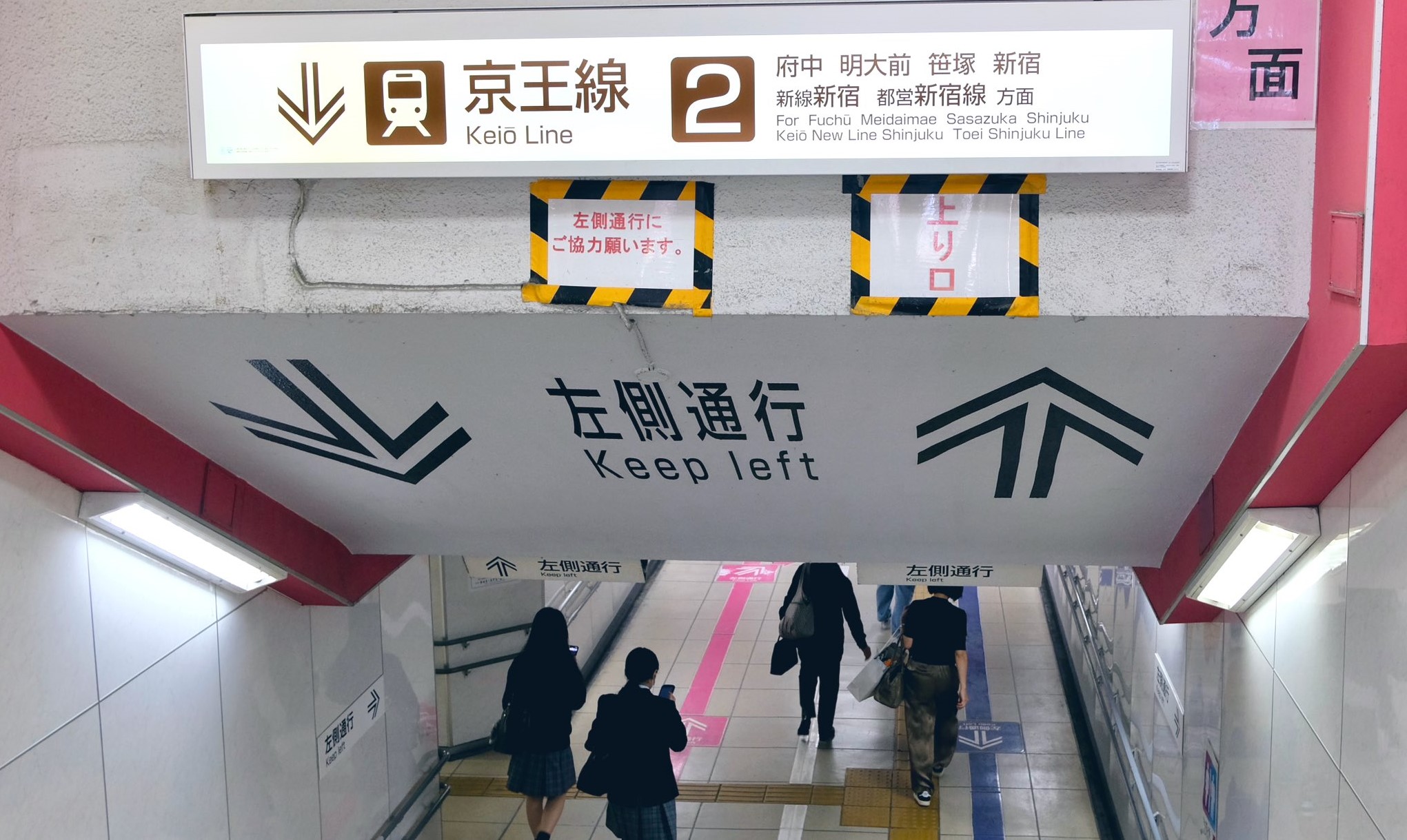
Japan Metros and Railway Stations
The best ground markings are in Japan, and are integrated with signage and tactile paver deployment, in Metro and in railway stations. Most of the Japanese examples shewn here are from the @lilycats.35 Instagram account, as well as from her @Haco_8_5 Twitter account. She is a station arrow and ground marking enthusiast, one of a very few worldwide. Your author is a recent convert. She was interviewed for a Japanese website, which you can read by clicking the Translate button (or right mouse button for Translate in the drop down menu).
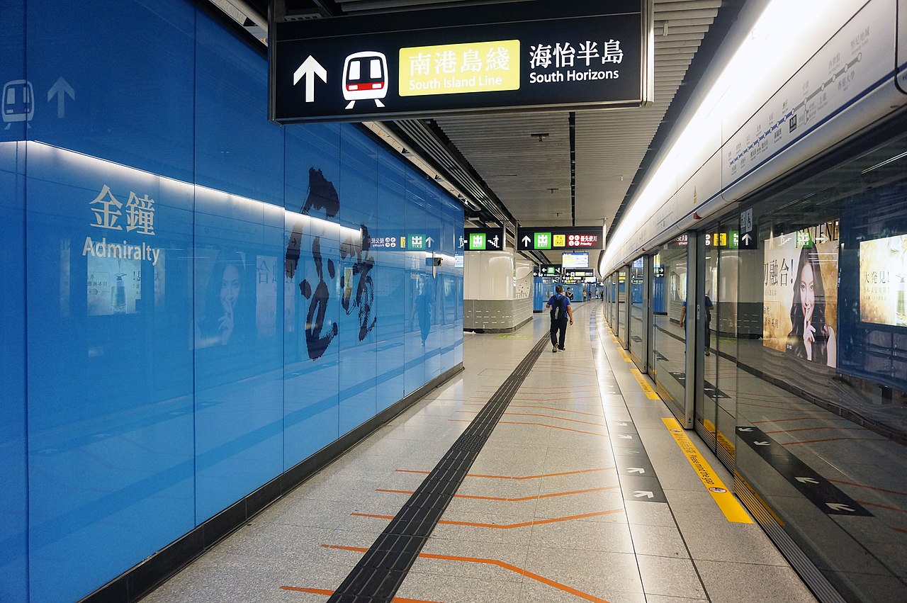
Hong Kong
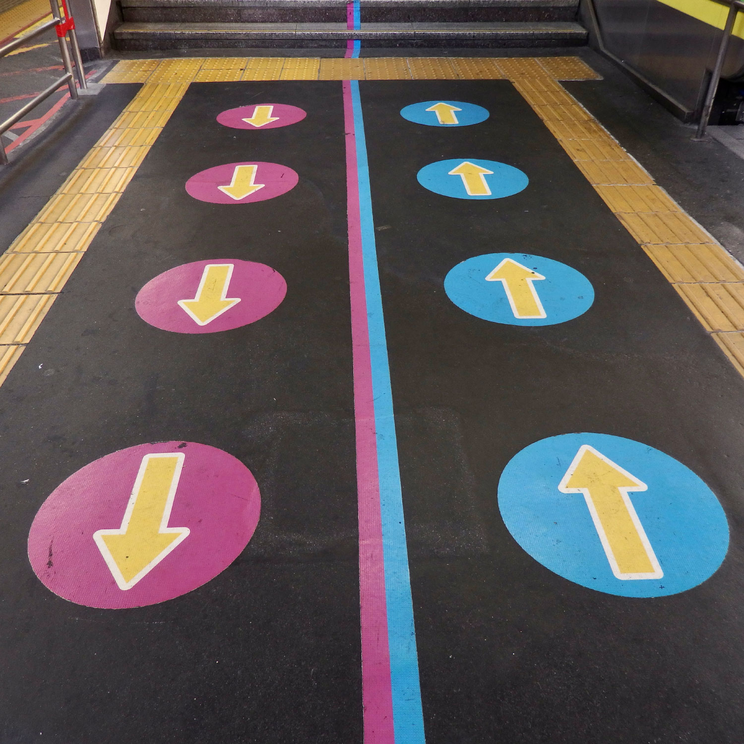
Hong Kong's MTR implemented a well integrated sticker and tactile pavers design to guide movement at the critical alighting and boarding points to reduce passenger turbulence, and thus dwell time:
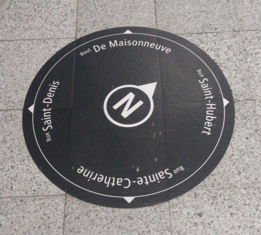
Métro de Montréal
Montréal has a consistent set of floor stickers for many different areas, the most coherent set that Mayo has yet seen. The director of wayfinding at the Système de transport de Montréal has done such a great implementation, that he is now in charge of wayfinding for all transport modes in Montréal.
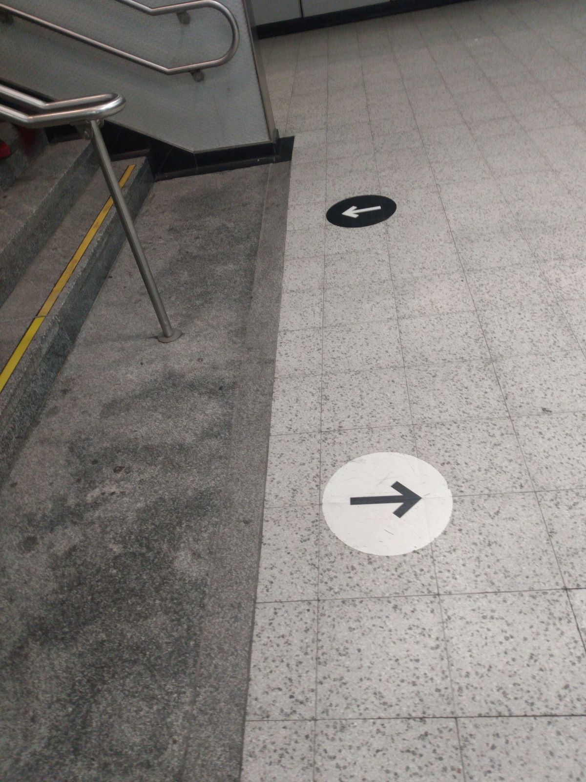
Many cities' Underground, Subway, U-Bahn, and Metro busy interchange stations need to implement such simple passenger orientation stickers:
Floor wayfinding (and tactile markings on buses) are also used inside public transport vehicles, for similar reasons.
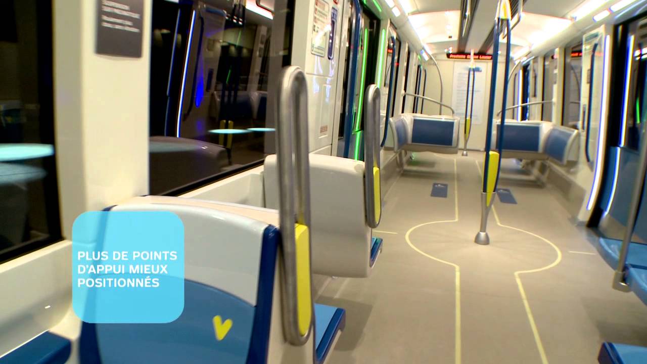
These strips remind passengers to keep themselves and their bags clear of walkways (when not standing room only) in next generation walk through trains. Although, in my own observation, these are not as successful as platform markings, due to different behaviours onboard trains. In case of power loss, these embedded strips are emergency lighting to guide passengers to the doors.
And the rest of the pack
London Underground
One of the first platform markings anywhere were the “MIND THE GAP” safety messages near platform edges. TfL has expanded its use of ground markings since then:
Paddington Railway Station
Some of Paddington’s Underground lines were at opposite ends of the station, hence there are floor stickers, colour coded in Underground line colours, to assist transferring passengers.
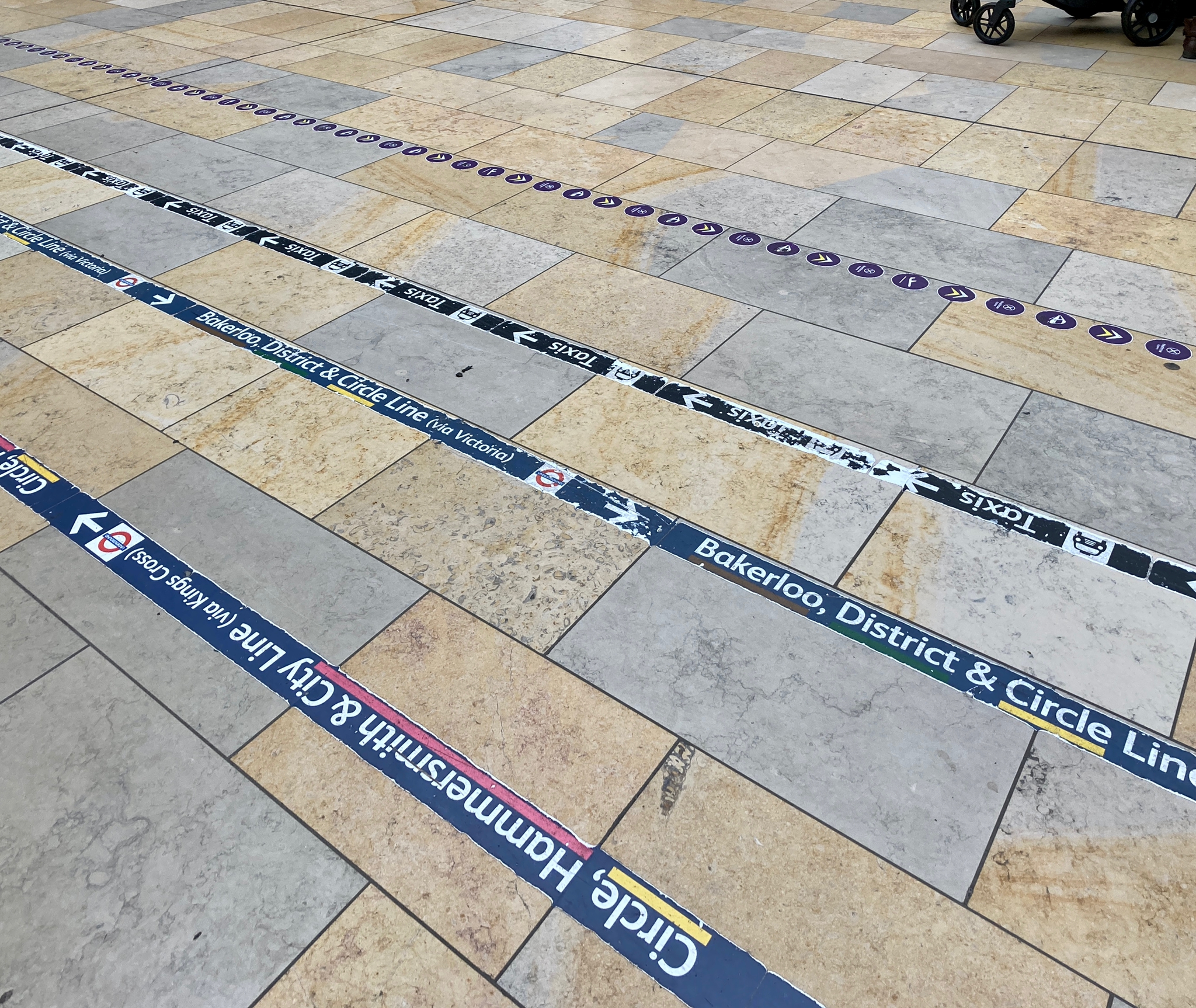
When the signage and scope of a space can be overwhelming, floor markings cut through the clutter for clear navigation and directions.
About 5 years ago, there were simple all yellow Circle and all pink Hammersmith & City line sticker strips at Paddington – seemed simpler, less busy, and much clearer than this current strip design. Paddington did also try using large circular floor markers of various types for the Elizabeth line, the Hammersmith/Circle and Heathrow Express. there used to be more of these. Some were laid down in May 2022 to help people transfer between Platforms A & B and Platforms 9-14 during the interim period when the Elizabeth line was a self-contained operation between Abbey Wood and Paddington to November 2022. Most of these have now gone or been worn off, bar some on the former taxi ramps. However, Paddington has new floor markings for Crossrail running across the concourse from the District & Circle exit.
Crossrail 1
Crossrail’s designers have eschewed platform and ground markings, so as to not bespoil the minimalist decor.
London Victoria Station
Victoria is a mainline station which also has a busy commuter train aspect, trains to and from Gatwick, London’s second-busiest airport, and Victoria Coach Station. The coloured linear strips led people to their transport mode, which also includes the Underground and a taxi rank, as well as to the toilets. The strips have all but gone now - perhaps they were not found to be ineffective? Hard to see that however, given the minimal expense in laying the stickers, and the great benefit of fewer passengers asking for directions.
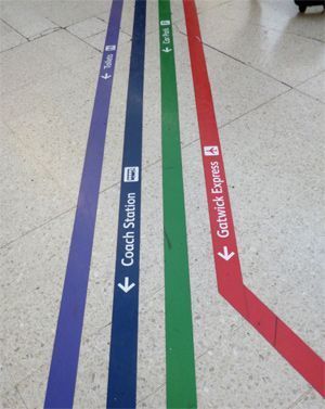
To be useful to those who are colour blind, the strips include line or destination text, direction arrows, and sometimes pictograms. The latter typically use the station’s wayfinding convention.
Thameslink does things differently
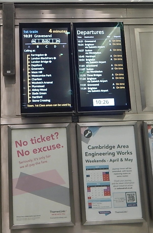
Thameslink uses Zones A to E platform markings to indicate the length of their trains, and the location of the accessible coaches.
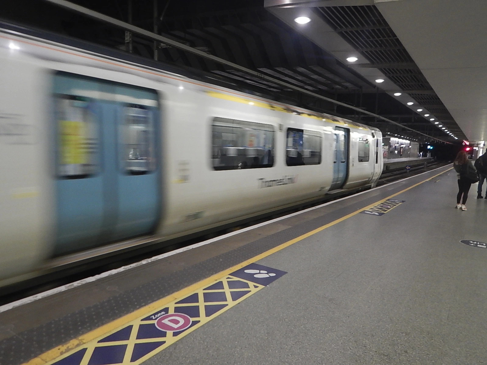
Unfortunately the diagram explaining this is small, and squished into the train destinations display. Other Thameslink/ GTR signage is much larger and more prominent, which can leave unknowing passengers to still scramble to catch shorter trains.
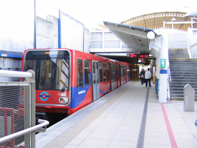
Lewisham DLR station
The red line on this station’s DLR platform denotes the 'Compulsory ticket area', wherein the passenger must touch their Oyster or contactless payment card flat on a yellow card reader. Whilst some DLR stations have ticket gates, those that do not have a red lined ticket area:
UK ground and pavement marking standards
The UK highway traffic tactile paver standards have been adopted by mainline and Underground railways, for consistency. Specifically, the DfT Guidance on the Use of Tactile Paving Surfaces, issued in 2021. Network Rail follows it, rather than having another set of standards of its own.
This Guidance describes six different types of tactile paving surfaces:
- Blister Surface for Pedestrian Crossing Points
- Corduroy Hazard Warning Surface
- Platform Edge (On-Street) Warning Surface
- Segregated Shared Cycle Track/Footway Surface and Central Delineator Strip (Ladder and Tramline)
- Guidance Path Surface
- Platform Edge (Off-Street) Warning Surface (only for use at the edge of railway and underground station platforms)
It is the last type that is of most relevance in this article, and applies to the edge of all off-street rail platforms, off-street tram or other LRT platforms.
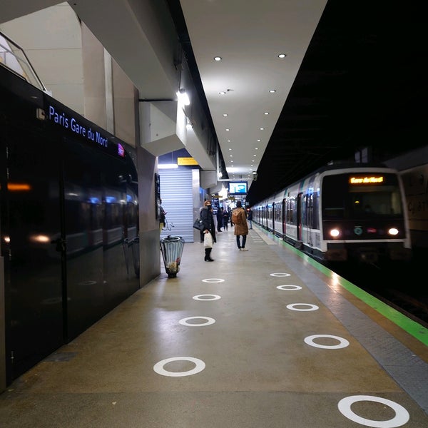
Paris Réseau Express Régional (RER)
Note the green platform edge strip:
Other examples from around the world
Milano, Italian capital of design
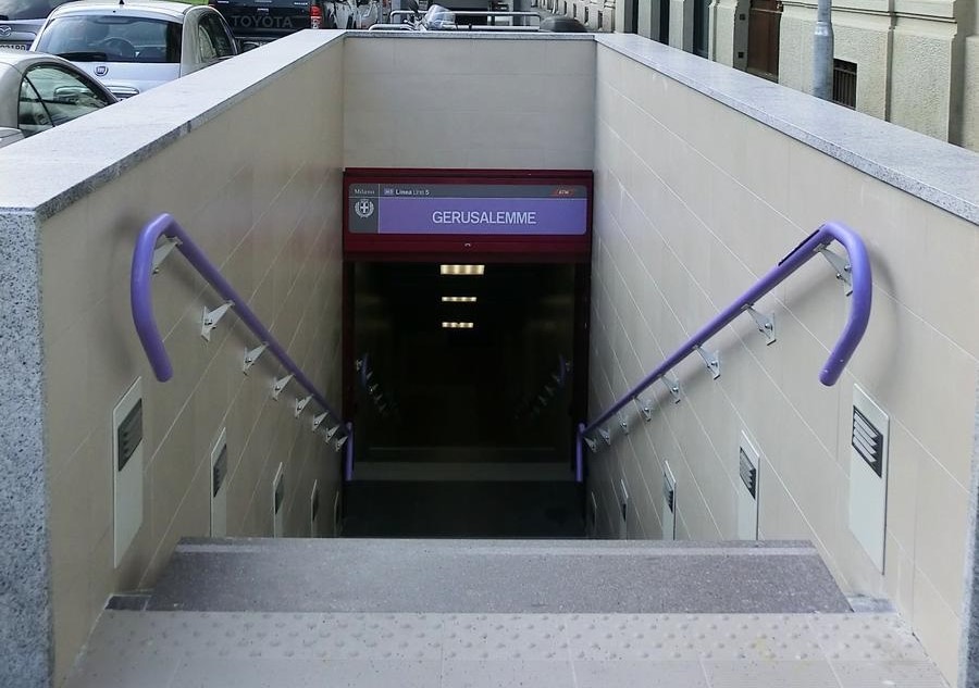
Milano Linea M5 (Lilac) handrails
Milano’s use of coloured handrails to connect routes at interchanges also subtly assists passengers. This example from Milano is evidence of the need for such detailed integration in all facets of wayfinding, such that it is instinctive for passengers. It is a Japanese level of attention to detail. This article has more background on the designer who initiated this on Milano’s Lineas M1 (red) and M2 (green), which has been implemented on Lineas M3 (yellow), M4 (blue), and M5 (lilac).
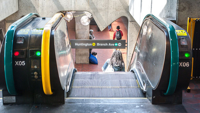
A few Washington DC Metro stations coloured their escalator grabrails to indicate the lines being transferred to, which is ingenious. More systems should implement this as they are much more noticeable:
Similarly, London Underground uses the tube line colour for train handrails, a subtle clue when transferring trains if you step into the wrong line's train. However the colours are inconsistently applied:
- The Piccadilly 73 stock uses both yellow and blue. Yellow is for the main grab rails (eg the vertical ones by the doors and the adjacent vestibules) and blue for the length wide handrails (eg those above the passenger seating).
- The Jubilee employs mostly yellow, but there’s still a few trains with grey handrails.
- The Central line uses both red and grey handrails.
- The Northern Line used to have yellow handrails, but these were replaced with blue ones.
Toronto Subway
Toronto used to feature floor stickers more for temporary ad campaigns than for wayfinding.... Fortunately, the Toronto Transit Commission (TTC) has implemented some large floor stickers at busy stations to reduce the turbulent flow of passengers exiting and entering trains:
Tactile pavers have been retrofitted to all Toronto Transit Commission (TTC) subway stations:
Toronto also uses in vehicle floor markings and textures to nudge passengers to keep aisles clear and indicate door location for the visibly challenged and really drunk:

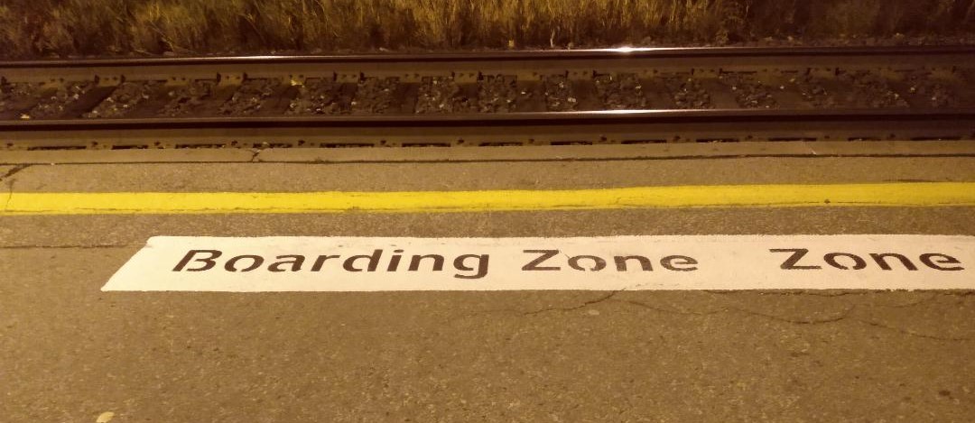
Toronto GO Train
Toronto is expanding its seven line, mostly tidal commuter train network into an all day regional train system. The lines are increasingly patronised, leading to crush loadings for sports and music events, as the regions highways are over capacity. The following photo shows the trial Boarding Zone painted at a few stations to have passengers stand close to where the two doors per passenger carriage open.
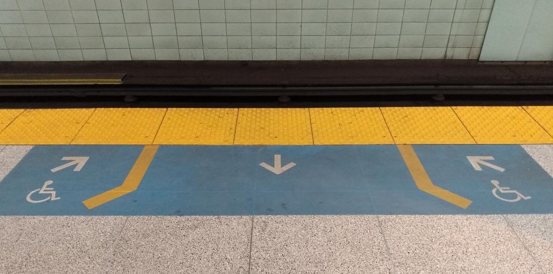
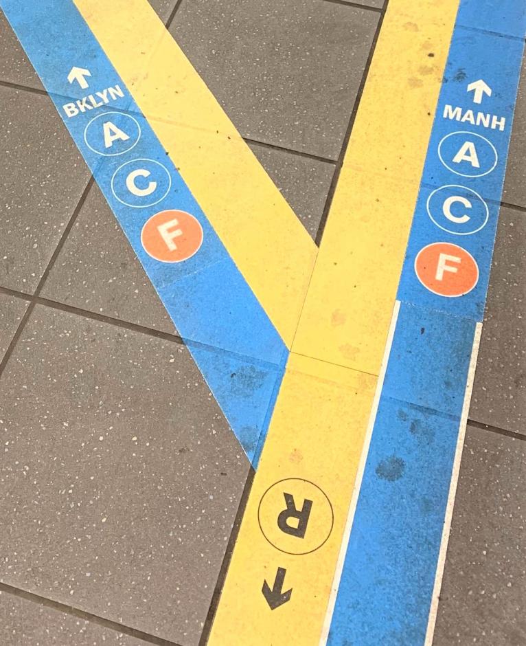
New York City
Melbourne
Ground markings can obviously also be deployed on pavement:
Dubai
Of course, there's always that one system that overdoes it. The new Dubai Metro has put a premium on being shiny and futuristic, to the great detriment of clarity and navigability. It's not clear where the white floor strips in the photo below lead to, although the left most black strip has accessible pictograms and likely leads to the lift. The green arrows overhead clearly indicate turnstiles to use, if the passenger notices them amongst all the other visual distractions. In Dubai, one needs sunglasses not just in the desert sun, but in the Metro as well:
Having fun with stickers
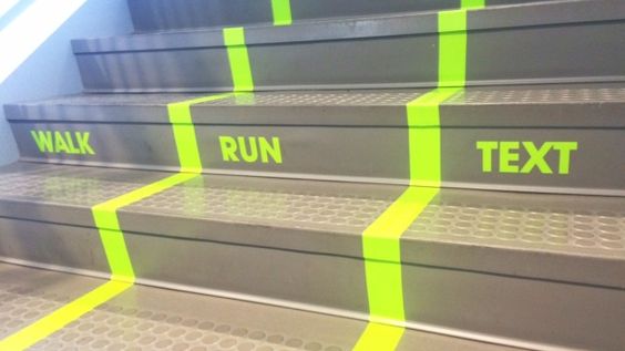
It is generally good for public transport agencies to have a sense of humour from time to time as well:
Advantages and disadvantages of stickers
Ground stickers can be applied as soon as they are printed up, as was the case for reminding passengers to maintain social distancing during the into Covid-19 pandemic. TfL and many other networks used to quickly install social distancing floor stickers at their stations at the beginning of the pandemic. And stickers are a small fraction of the cost of traditional station signs.
However, ground stickers wear out, so often need replacing every few months. Whilst tactile pavers could make it difficult for wheeled mobility devices to traverse.
Nudging to reduce dwell times
These are all behavioural modifiers, nudges being the more familiar term. As we looked at in our review of the book Transport for Humans, these are subtle cues to nudge users' behaviours toward more desirable actions. Individually they may not appear to be much, but in the aggregate they can make substantial improvements. As an example, TfL works hard to find ways to shave a few seconds off of Underground train station dwell times. Underfoot wayfinding cues can help here, and in the flow of passengers within and without stations.
The following senses are employed, not just on platforms, but on all manner of public transport vehicles:
Colour
- Line coloured poles and grips to subtly let passengers know which line they’re on.
- Line specific moquette to subtly let passengers know which line they’re on.
- Floor markings denoting bus door swing path.
Texture
- Tactile lines to indicate exits.
- Gritty surfaces on steps and floors for better grip in wet and snowy weather.
Shape
- Small dimples on the platform edge strip.
- Grooved linear lines perpendicular to the direction of travel to alert users to stop.Grooved inserts in the leading edge of stair treads for identification of the step, and for better traction.
- Grooved inserts in the leading edge of stair treads for identification of the step, and for better traction.
Lighting
- Above vehicle doors to spotlight key floor markings, door swing, and the floor edge.
Contoured design
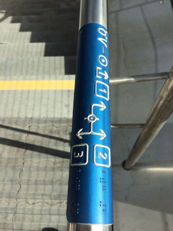
This handrail is the best example we've yet seen at integrating different senses together in one seamless design:
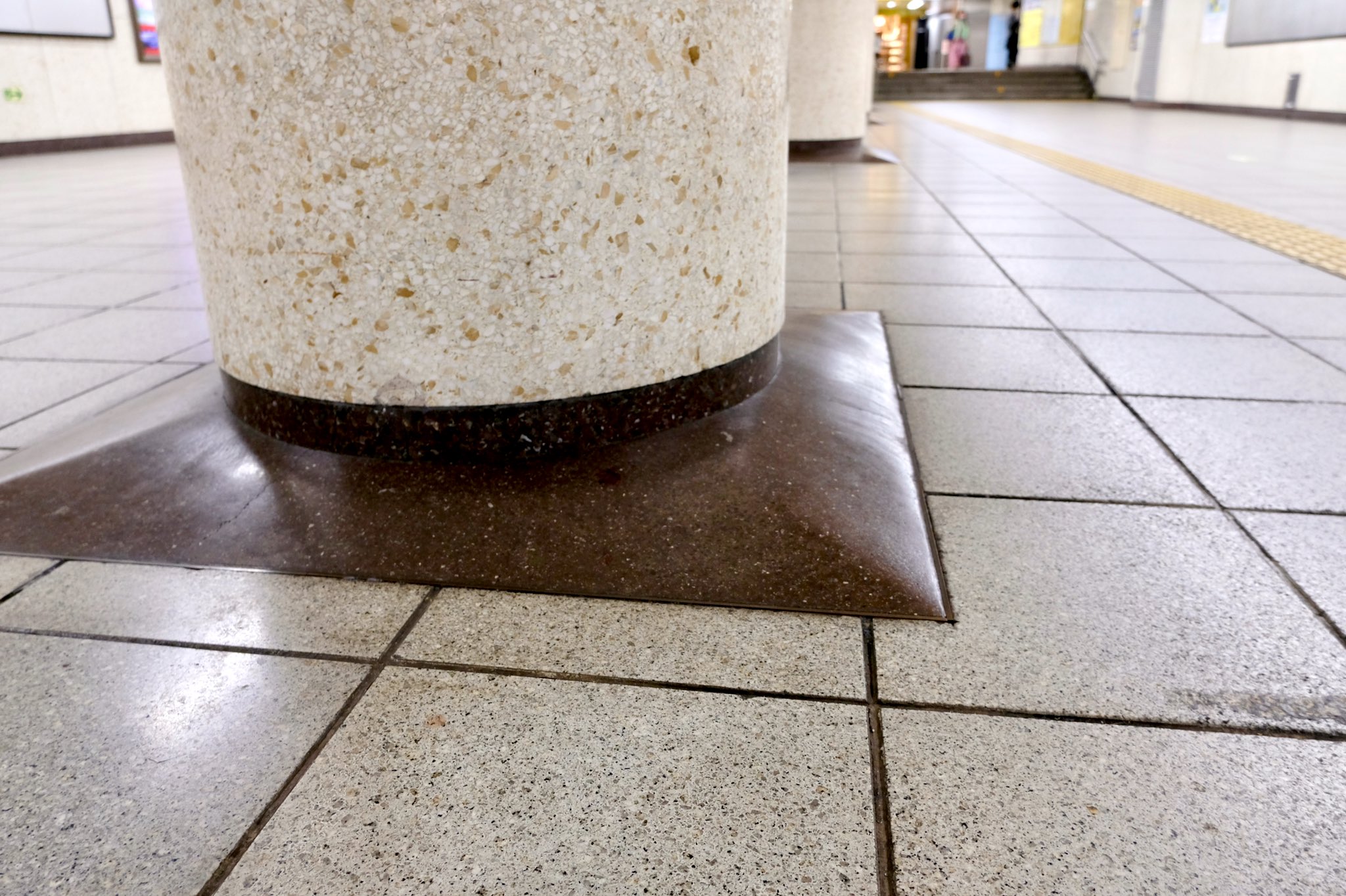
This raised collar around columns in this Japanese railway station subtly notifies carts and walkers of the obstruction, avoiding a full on collision and damage. It is great to see this attention to detail:
Door opening positions
With increasingly accurate automatic train operation (ATO), trains are able to stop accurately within a few centimetres. To reduce platform crowding and jostling at the doors and to reduce dwell times, many systems now indicate the door opening and standing positions on the platforms. Like red paint on pavement, they remind people to stay out of the area.
Vehicle ceilings can also be used for wayfinding
As transport agencies expand their use of the full stage of platform, station, and vehicle floors, a few have ventured into another dimension – ceilings. Whilst not always immediately noticeable, they are visible in crowded conditions, especially for shorter and wheelchaired individuals. Here is an example:
Both of the following real world examples were suggested by the excellent TransitMap.net site:
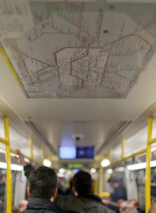
Here is a station ceiling wayfinding example – from where else? – Japan:
Ceilings nevertheless are a hitherto relatively unexplored dimension of wayfinding. They have the benefit of being out of range of passengers' hands (in most vehicles and stations), so will remain unaffected by wear or graffiti.
The dual uses of tactile pavers – the field is evolving
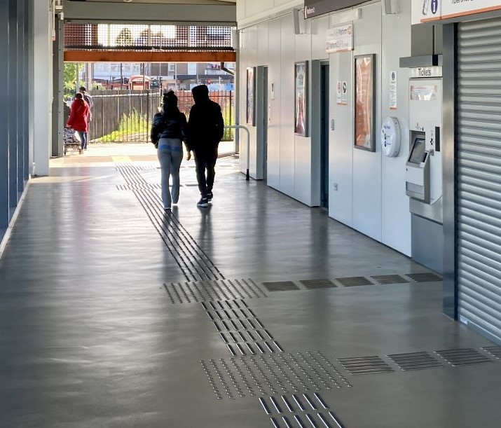
Be that as it may, it appears that the safety aspect of tactile pavers for rail stations has become its primary role in many rail systems outside Japan. Nonetheless, this example from the UK’s new Perry Barr station shows the use of directional tactile pavers:
Tactile paver deployment outside of Japan continues to be incompletely implemented in many systems, however. Either the potential has not even been realised, or they are used in an isolated manner, not integrated with the rest of the wayfinding signage.
That is the wrong approach, according to Mayo. Seiichi Miyake’s invention has become lost in translation. The use of directional tactile pavers in Japan is significant and that directional aspect was always Miyake’s priority.
Cultural issues
In the UK, avoiding stepping on floor or ground lines may stem from an associated fear of treading on joints in pavements, stoked up by the poem Lines and Squares from Winnie the Pooh creator A A Milne:
Whenever I walk in a London street,
I’m ever so careful to watch my feet;
And I keep in the squares,
And the masses of bears,
Who wait at the corners all ready to eat
The sillies who tread on the lines of the street,
Go back to their lairs,
And I say to them, “Bears,
Just look how I’m walking in all the squares!
Nonetheless, safety is a higher priority than wayfinding in most public transport agencies.
ChatGPT was not used in the writing of this post.
Many thanks to Rob Mayo for sharing his wayfinding experience in the preparation of this article, to Cameron at TransitMap.net, and to Daniel Wright of The Beauty of Transport online magazine for his provision of the UK tactile standards.
Header image is the painting Metro Departure by Peter Harris.